
As tomorrow is my 30th birthday, today marks the last day of me being in my 20s.
Honestly, it is a little depressing, but I am also thankful to have made it this far. Here's to a fantastic next decade!
Over the past few days I've been having a little bit of a play with the newly released Microsoft Office 2013. I had received a free upgrade after purchasing a license of the 2010 Home and Student Edition late last year to update Despina's laptop after receiving much consternation from her about still having to use Office 2003 (which I could perfectly understand; 2007 and 2010 were such massive improvements over 2003).
Office 2013 doesn't really offer up much in terms of change over 2010. Other than much better cloud integration with SkyDrive, the only other obvious changes for the average user would be the look, and slight optimisations to cater for touch input.
The look of Office 2013 carries on with the current UI 'fashion' of washing out colours. I have been very critical of this in the past, and I'll continue to be where it serves no other usability benefit, and especially when it detrimentally affects usability.
Other than the bland and washed out new button icons in Office 2013, the biggest example of this is the non-document areas now being an almost-white colour by default. Within a short period of time using Word 2013, this caused my eyes to strain because of the amount of white on the screen, and also confusion because there wasn't any obvious differentiation between the editable 'document' area and the program background or toolbar/ribbon.
Thankfully, there are two other theme options to darken the background and toolbars a bit, but apparently those weren't included in the consumer preview ('release candidate' in software speak) that was released last year. It was only after the strongly negative user response that the options were added; we can at least give Microsoft a bit of credit for not being too stubborn in that regard (*hint hint* Windows 8). The setting can be changed by going to: File > Account, and it's under 'Office Theme'.
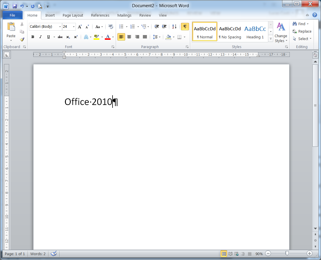
Screenshots of the three 'theme' settings are shown below, including Office 2010 as a base comparison (ignore the squashed toolbar buttons; I've resized the windows down to just demonstrate the colours). I've also purposely left the red underline in the text to highlight the misspelling of the theme name despite my language settings being correctly applied for the suite :P.

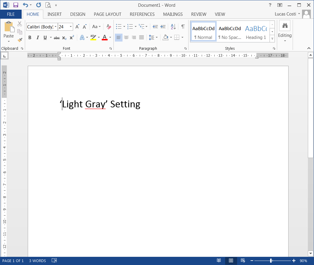

I've personally got it set to the 'Light Gray' setting. Although I prefer the 'Dark Gray's darker background colour, I did want to persist with the program colour for the menu colours, bottom bar, and tab selection (in this case it's blue for Word).
I don't know if I'm just old-fashioned, but in looking at all those screenshots from a usability perspective, Office 2010 still looks the best to me: there's a good contrast between the document and its background, and the toolbar and buttons are clearly distinguished from the editable document, not to mention it having a lot more 'life' to the look of it.
In general, I don't mind change. However, it has got to be for a beneficial purpose, and not merely to pander to the current 'fashion' at the expense of usability. There are some good interface changes (like general simplifications, and the emphasised colour associations for the different programs: blue for Word, green for Excel etc.), but the default 'White' theme they want people to use is, in my opinion, terrible from a usability perspective.